& the slipper still fits
Showing posts with label fonts. Show all posts

marlborough mills

It's been gloomy around Lancaster lately, with all the snow and grey skies. And often the weather outside reminds me of Gaskell's North & South. So with a few extra hours at my disposal - thank you Jack Frost for the snow - I decided to indulge a little with my favorite adaptation. As Mr. Thornton talked in my ear about cotton clothes and fair masters, I crafted some logos for our favorite mill.


For these logos I focused on the traits of Thornton - traditional, hard working, simple and clear - and researched Victoria Era type as support. Thus, the strong favoring of serifs. Thus, the decided tagline of "English-Made Cotton". In our adaptation, Thornton doesn't use words like "fine" or "regal" to talk about his cotton; it is good, and good is the appropriate word to him. "Good Cotton" wouldn't sell, but English-made would. Let's just say Mr. Bell had his say.

Wallpapers to come next week.

font compliments - sans and serifs

Are you looking for some perfect font matches for this Valentine's Day? Well I present some sans and serifs that will make your font compliments compliment each other. Many of these fonts are new(!) and can be downloaded for free. Enjoy!


deck the halls


ALEX BRUSH // ALLURA // ARIZONIA // BIRCH STD // CRYSTAL DECO // EUPHORIA SCRIPT // YELLOWTAIL // JUSTUS // LUST // MERVALE // PLAYBALL // ROCHESTER // SOUTHERN AIRE // BASKERVILLE ITALIC

Despite the fact that I am adamantly anti-Christmas music until November 28th, it is not too early to start thinking about your holiday card. And if you're going to make it yourself - it REALLY isn't too early. Above is a collection of lovely fonts to get your merry & bright inspiration going.

Like with the fall fonts, remember that these selected fonts are featured in their best light - highlighting certain letters and spacing. As with most things, have an idea in mind and feel free to experiment.

font compliments - fall

Last month I featured some fonts for fall. They played on the spooky and creepy look of Halloween. Today, I want to show some font combination using selected fonts from that list. Because, well what good is one font if you can't combine it with a few others?

For these compliments, I heavily rely on the kindness of the serif fonts. They provide and grounding and tradition that combines well with the strangeness and creepiness of the featured fonts. Enjoy!

For a look with Suspense

Suspense can be a difficult emotion to show without thin capital letters running across the page. Here I present a different way to show suspense - a scribbled hand and traditional type set. The roughness of Hoefler combined with the clean, forced capitalization of Minion Pro tricks your eye; it is unclear if you are reading an old gothic novel or a new book. Either way, the key is the serif of the fonts. Note: both Minion Pro and Hoefler Text are set with a 50pt kerning adjustment. "Silent. Quiet" is Hoefler Text Italic. 

For a look with Horror

There is a strange slickness to horror, to fear. And to capture that with a font takes a fountain pin look combined with the futuristic lines of a sans-serif. Here, I've paired Jellyka (notice I still haven't used an H) with Futura and the all caps feature of Ostrich Sans Medium. The balance lies in the control of the sans fonts verses with wildness of Jellkya. Note: Ostrich Sans Medium is presented at a 150% stem height and a -100% kerning. Leading was set at same at font pt.  

For a look of Magic

It would be easy to give you the Hogwarts font. It would be easy to hand you a hand font and call it Harry's. I wanted to go a different way with magic this year and -- as seems to be a running theme -- go a little retro. A look of magic lies again in the serif nature of the fonts and their regularity. Fine Style Regular is a wonderful header text. It's small spur touches and unique kerning allow what could be an unremarkable font to shine. Adobe Garamond is a natural fit to par with. It too has unique attributes in its construction and works best as a text italicized next to another serif font. Ayres Royal was my own fancy. Who would't have a glorious old-world font in their spell book? Note: Fine Style Reg. had a leading of 2pts larger than the font size. Adobe Garamond has a 25% kerning increase. 

For a look with Lust

Lust - a particular challenge given my determination to stay in the selected fonts of the fall fonts pack. When I think of lust in a font, I think bold, thick lines and movement. Thufap is just the font - with just the right hungry energy for the Halloween season. That "g" - how can it not be lustful? Thufap is paired with another font from the pack, Baskerville Regular. Baskerville's thin serifs and rounded counters give it an almost bubbly balance to the moment in Thufap. Note: both fonts have a increased kerning of 50%. Baskerville's leading is 2pts more than its font size. 

fontspiration

A few days back I found this fantastic article on grouping fonts for your designs. I love finding articles like this. Tell me, when was the last time you only wanted to use 1 font on anything? That's right - NEVER!

Even on our blogs, we have multiple font choices to make and more often than not, we go with what we've always used (inherited from a previous theme or blogger) or just go with one font to be safe. H&FJ gives us the bolstered confidence to not be scared about mixing fonts; and gives us some direction on how to do so too. They even made beautiful and lovely mock ups to show us just what the font combinations would look like in action. I was inspired! Excited! Let's start using these methods to group our own fonts! 

Enter - Heather's tiny problem. I thought all the fonts they were featuring where accessible. In other words - free. I totally somehow missed the purchase font now button on the bottom. 

Do you know how many times lately I've looked for a new font, and then am told I'd have to pay for it? A LOT. This does not make me happy. This is not something I can afford. But wait! Don't despair! Luckily, I'm a little more creative than I thought I was. 

There are free fonts that can help us achieve these same font groupings. And I'm going to share my knock-off font picks with you. Just so we can do a page-to-page comparison, I'm going to use the same colors featured on H&JF's font examples. Let's see how this maps out.

Disclaimer: Buying fonts is like buying artwork - you're helping an at times impoverished medium and artist and helping foster creatively for things we use everyday. If you adore a font - buy it. That being said, there are thousands of free fonts that are beautiful, inspired, and um...cheep. I'm not saying don't buy a font. I'm saying don't feel like you have to buy a font. With enough looking, you'll find something very close to what you were going to pay $100 for.


For a design with Wit, it would cost $427. Here I've replicated the mock-up example using a variation of Bebas (my favs!), Dunkins Sans and Chaparral. Other fonts that could be used to create almost the same look are Headlines One, Antipasto, and Big Mouth. To get this exact look, I did have to play with the character settings in photoshop (this occurs with all the other mock-ups as well.) "Lady Earl Gray" is the font Bebas New set with a gray gradient layer effect on 20% opacity. "Lovely / On the House" is the font Dunkins Sans (based on the Dunkin Donuts font) bolded, with a letter spacing of 200%, and a character height of 120%. "20 individually..." is Chaparral at no change. 


For a design with Energy it would cost $467. This was the first font group I tried replicating and love what I get when you mix Chunk 5, Bebas Original and Fanwood text. Here, I wanted to give you a few secondary options that look just as fantastic. "Breakfast/Mornings/and the food titles" are set in Chuck 5 with no changes. "Cafe de la.." is in Headline One with no changes. Numbers and "Tiffany's/Gwen..." are in Fanwood text with no changes other than regular or italic settings. And "1224..."/food descriptions are in Antipasto no changes. "Reservations/Owner..." are also in Antipasto, but the line height was adjusted to 80%.


A font group with Poise presented the greatest challenge for me. And priced at $697 it should. I'm still not totally happy with the smallest font Ostrich Sans as a subsitution for Verlag, but it does the job well. "Lion Roars" is in the font Black Oak set at a 200% line height and adjusted to have a 18pt space in between each letter. Justus has no changes other than it is set to Italic (a drop down option, not the italic button) for "Just the...", and Ostrich Sans is set to Bold Black and then Medium for "New prosperity...".


A design with Dignity? Well that will put you back $567. What's surprising about this font set, is you could replicate it with Times New Roman, Garamond, and Verdana...if you wanted. (Those all come free on your computer...fyi). Here, I've used Adobe Garamond (a thinner lined font tweaked by Adobe) with no changes for "Lizt Remembered/Suite for Chopin"; Circle New with a character spacing of 50% for the "CML info"; and Fanwood text, all caps and not, for the "The history of" and the paragraph of Lorem ipsum.
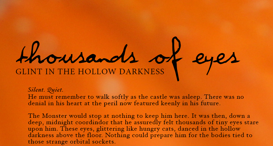