For these compliments, I heavily rely on the kindness of the serif fonts. They provide and grounding and tradition that combines well with the strangeness and creepiness of the featured fonts. Enjoy!
For a look with Suspense
Suspense can be a difficult emotion to show without thin capital letters running across the page. Here I present a different way to show suspense - a scribbled hand and traditional type set. The roughness of Hoefler combined with the clean, forced capitalization of Minion Pro tricks your eye; it is unclear if you are reading an old gothic novel or a new book. Either way, the key is the serif of the fonts. Note: both Minion Pro and Hoefler Text are set with a 50pt kerning adjustment. "Silent. Quiet" is Hoefler Text Italic.
For a look with Horror

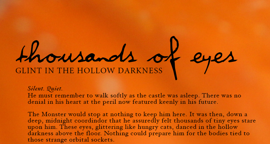
JELLYKA // FUTURA // OSTRICH SANS MEDIUM
There is a strange slickness to horror, to fear. And to capture that with a font takes a fountain pin look combined with the futuristic lines of a sans-serif. Here, I've paired Jellyka (notice I still haven't used an H) with Futura and the all caps feature of Ostrich Sans Medium. The balance lies in the control of the sans fonts verses with wildness of Jellkya. Note: Ostrich Sans Medium is presented at a 150% stem height and a -100% kerning. Leading was set at same at font pt.
For a look of Magic

It would be easy to give you the Hogwarts font. It would be easy to hand you a hand font and call it Harry's. I wanted to go a different way with magic this year and -- as seems to be a running theme -- go a little retro. A look of magic lies again in the serif nature of the fonts and their regularity. Fine Style Regular is a wonderful header text. It's small spur touches and unique kerning allow what could be an unremarkable font to shine. Adobe Garamond is a natural fit to par with. It too has unique attributes in its construction and works best as a text italicized next to another serif font. Ayres Royal was my own fancy. Who would't have a glorious old-world font in their spell book? Note: Fine Style Reg. had a leading of 2pts larger than the font size. Adobe Garamond has a 25% kerning increase.
For a look with Lust

Lust - a particular challenge given my determination to stay in the selected fonts of the fall fonts pack. When I think of lust in a font, I think bold, thick lines and movement. Thufap is just the font - with just the right hungry energy for the Halloween season. That "g" - how can it not be lustful? Thufap is paired with another font from the pack, Baskerville Regular. Baskerville's thin serifs and rounded counters give it an almost bubbly balance to the moment in Thufap. Note: both fonts have a increased kerning of 50%. Baskerville's leading is 2pts more than its font size.